
Many services charge you to show you how your keywords rank in Google search results. While there are some free versions, they don’t give you many options to modify your data. Today we are going to show you how to view 100% accurate ranking data so you can measure the status of your SEO efforts.
Disclaimer: We are not going to be covering how you can go about installing Python or its modules as that is a separate topic and there are several tutorials about this on the web.
What you need:
- Access to your Google Search Console
- Google Data Studio
- Python 3
- The pandas and matplotlib modules
First, we are going to get the information. Let’s go to the Performance report inside the Google Search Console account that contains the data you want to work with. Simply exporting the data is not enough because Search Console averages the rankings for each keyword within the selected period. This means that if you want to see the positioning for the last year for a specific keyword, GSC will give you a single number, the result of the average positioning of each day for that keyword. As we need the detailed data day by day, let’s move on to the second tool…
If you have not already added the Google Search Console data source to the Data Studio, you can read this post that details how to do it.
In Google Data Studio we are going to insert a table and add the information we need. We need the date of the last year segmented day by day, the keywords, the clicks, and if you want also the impressions and the CTR.
How to set up the table
Select the following dimensions
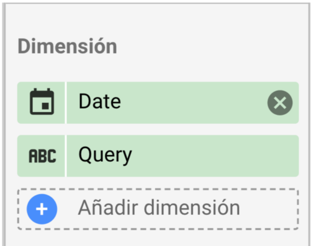
Date and Query. You will need to click on the calendar icon and select the Date and Time – Day of the month (DD) option. This causes all the keyword information (or queries) not to be grouped together but to show averages day by day of the year.
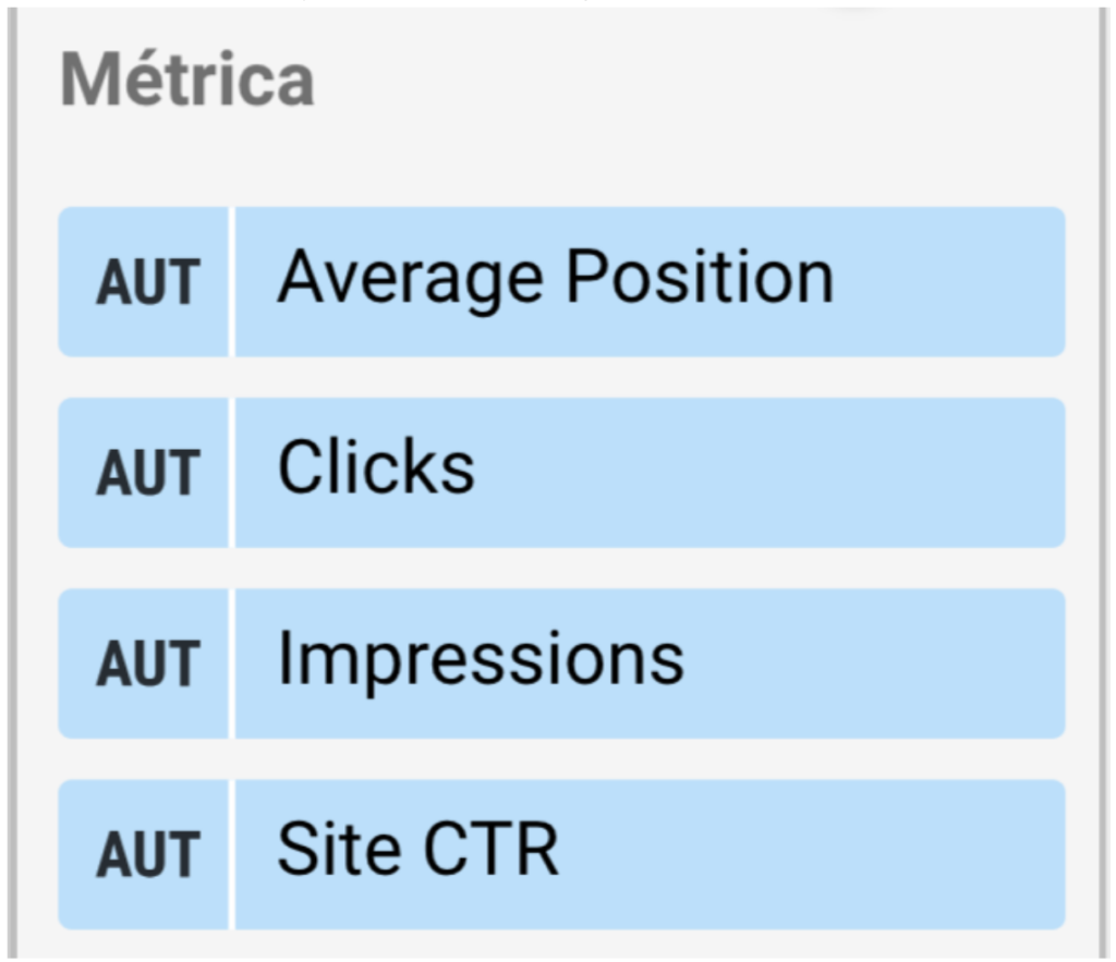
Once that is done, select the following metrics:
Now let’s specify the date we want to contemplate. You can choose the period you want, although it is advisable to export as much information as possible (Big Data!) and then filter specific periods with Python. We filtered to see all the data from last year.
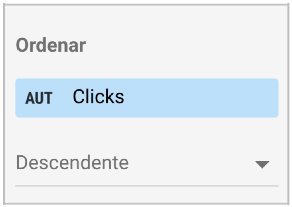
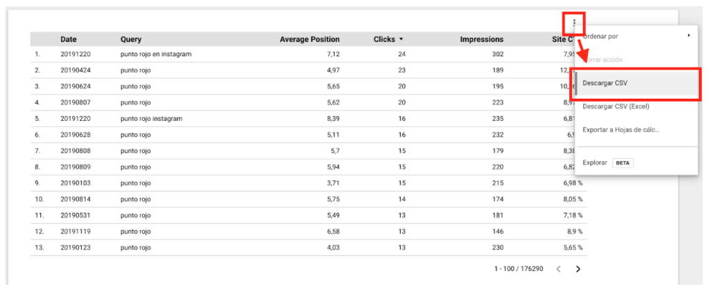
It is not necessary to sort the information by any particular variable because we are going to modify it later, but some may get an error if they do not. In our case, we sort by clicks as shown in the image.
After setting up the table as instructed, you should be seeing something similar to this (but with your data).
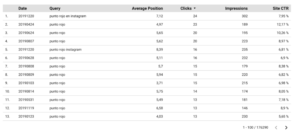
Note that we have over 175,000 rows of information. Depending on the amount of traffic to your site, this number could vary considerably.
Next step, we export the data. We will save the file with the name data.csv. Depending on the number of rows in your table, the download may take up to a few minutes. Patience… it is worth it!
Now the fun begins! Open your favorite code editor. In our case, for this kind of thing we are going to use Jupyter Notebook but you can easily copy and paste the code in a notepad and save it with .py extension that will work the same way.
The code for plotting, loading the data, modifying it, and plotting it is the following:
import pandas as pd
import matplotlib.pyplot as plt

keywords = ['keyword 1', 'keyword 2', 'keyword 3'] #your keywords here
rank_limit = 30 #Number of items to analyze

#The following lines do not need to be modified
df = pd.read_csv('data.csv')
df['Date'] = pd.to_datetime(df['Date'], format='%Y%m%d')
df = df[df['Query'].isin(keywords)].sort_values(by=['Date'])
df.set_index('Date', inplace=True)
df.groupby('Query')['Average Position'].plot(legend=True, figsize=(19.20,10.80))
plt.gca().invert_yaxis()
plt.title('Keyword rankings\n')
plt.ylim(top=0.75, bottom=rank_limit)
plt.show()

#Uncomment the following line to save the graphic to a file
#plt.savefig('keywords_rankings.png')
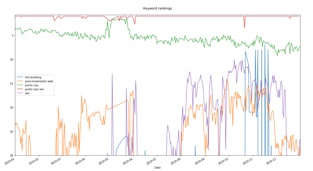
The result is going to be something like this:
But let’s not fall into the copy/paste trap… let’s analyze these lines of code to see how we can modify them to display the keywords we are interested in. Let’s analyze the script line by line.
- It loads the pandas module. To explain it in an oversimplified way, pandas is something like Python’s “Excel”.
- Loads the matplotlib.pyplot module that allows plotting the data
- –
- A list containing all the keywords that we are interested in plotting
- Shows the number of positions seen on the y-axis of the graph. For example, if you only want to see the behavior on the first page of Google, set this value by 10
- –
- Everything below doesn’t need to be modified, but let’s look at it anyway
- Load the data from the ‘data.csv’ file to a pandas data frame (it would be something like the equivalent of an Excel or Google Sheets spreadsheet)
- Change the ‘Date’ column from number to date format, in order to plot the x-axis correctly.
- Filter the data frame to use only the rows that contain the keywords declared in line 4
- Set the date column as index of the data frame since we are going to plot date by date
- Group the position values by keyword. This step is fundamental since it orders the data to be able to plot it. Think of it as preparing each line of the chart.
- The .plot() makes it show it as a graph instead of a table.
- You tell the chart to display a legend with information about what keyword each line represents.
- Determines the size of the chart
- Invert the y-axis of the chart since a low number position is a good thing and when “positioning drops”, its rank increases in number
- Set the title of the chart
- Set the upper limit of the chart to 0.75 so that we can correctly see the lines that have rank 1. Otherwise the line of a first position would be lost at the edge of the chart.
- The chart that has been set up so far is displayed.
- –
- –
- If you uncomment this line by removing the ‘#’ character at the beginning of the line, the chart will be saved in the folder where the script is saved with the name ‘keyword_rankings.png’.
This simple script with less than 20 lines is a clear example of the potential that Python has to analyze your SEO data and be able to take clear actions accordingly. The learning curve for this sort of thing may be a bit steep at first but the reality is that there is a huge community of people documenting tutorials, strategies, useful tools, etc.
The future of business decision-making in recent years has been moving towards big data analysis and SEO is no exception. From PuntoRojo we always encourage you to do your best to grow your knowledge to take your SEO strategies to the next level.
Needless to say, any questions, comments, or suggestions are welcome in the comments of this post. As always, good rankings!